The challenge
For my solo project during the five-day challenge in the UX/UI Design Bootcamp at Ironhack Berlin, marking my third week of exploring UI concepts, I was tasked with designing a responsive website for either an existing or fictional festival. I opted for a fictional surf film festival and embarked on the design journey. At the end of the week, I presented my work to experts in marketing, development and design. Then, I shared the design with a classmate who was also learning web development at Ironhack using Zeplin.
Research
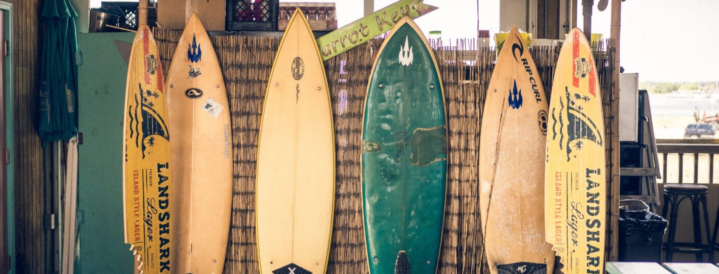
First, I checked out some competitors' websites to see what features other surf film festivals offer.
Interviews
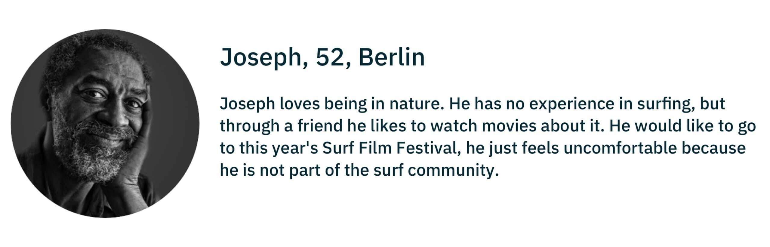
After that, I interviewed both attendees and non-attendees of surf film festivals. I discovered that people who haven't attended before are actually quite interested, but they're hesitant because they feel they might not fit into the community.
Define
User persona
Mood board
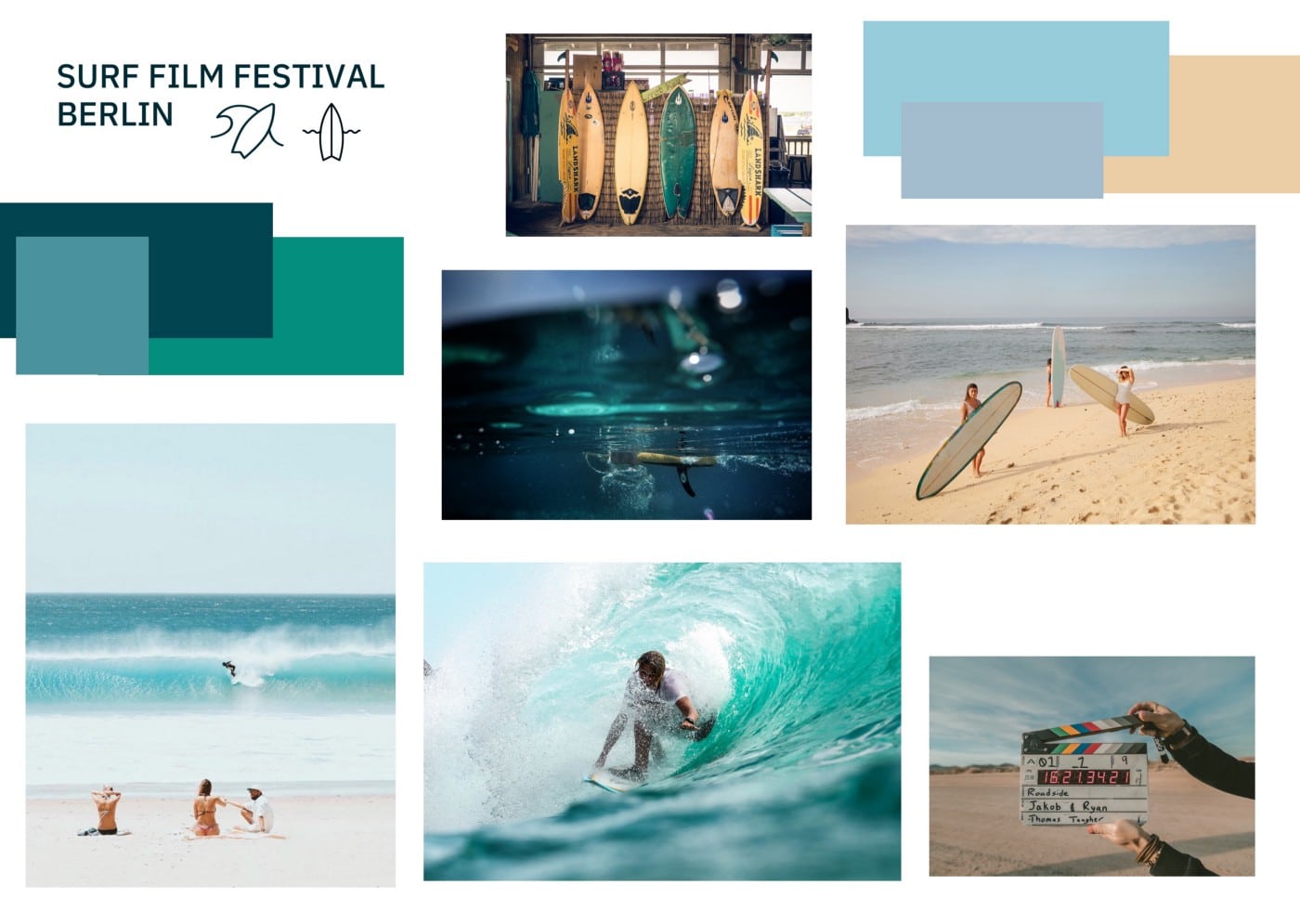
From the user interviews, I determined that the website should feel approachable, comfortable, and casual to users. Using these characteristics, I created a mood board to visualize how the website could look.
Ideate
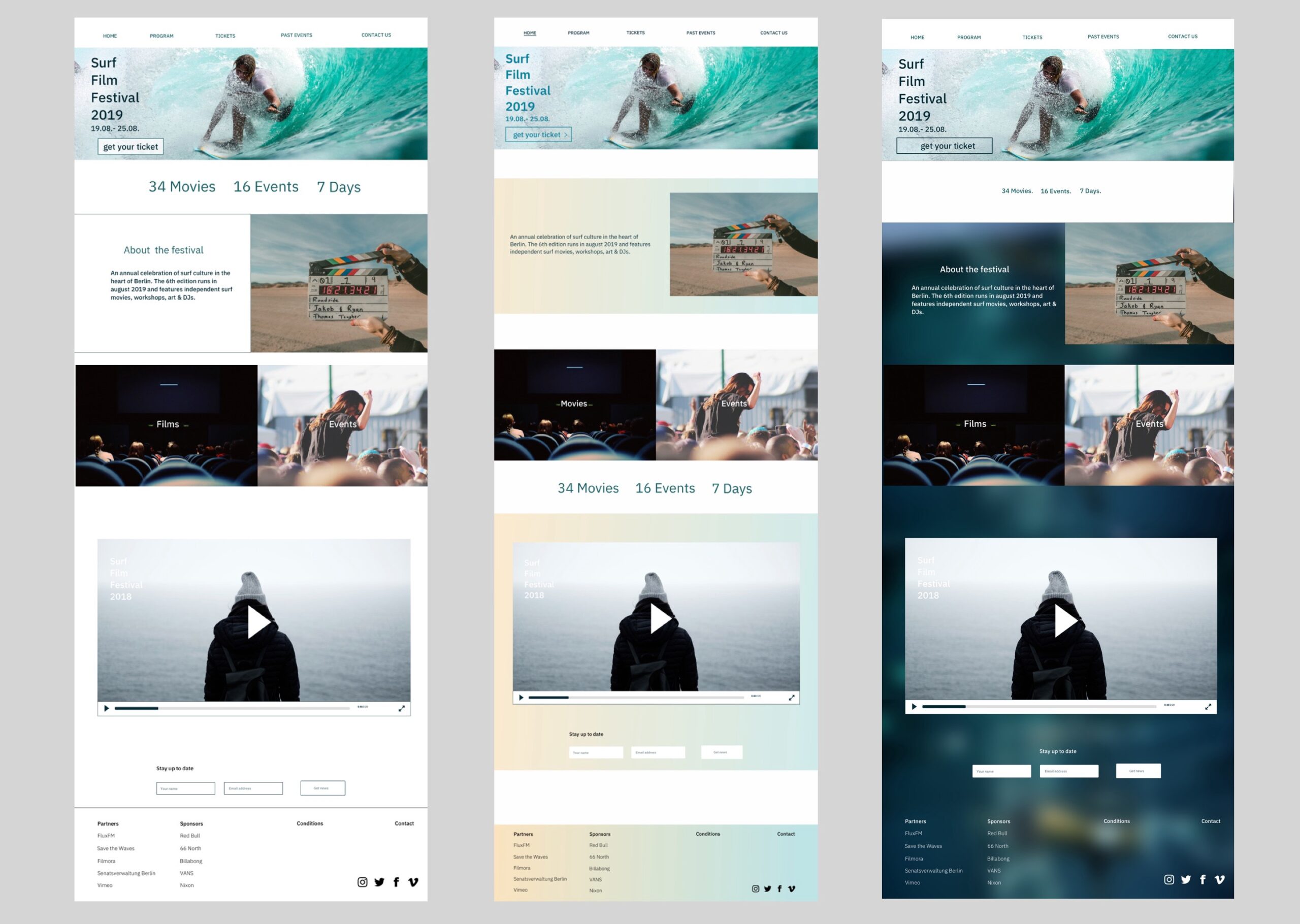
I began translating the mood board into my design and experimented with colors to evoke the desired mood. Throughout this process, I designed several versions, a couple of which are showcased below. In one iteration, I aimed to replicate the hues of the beach and the ocean's movement. In the other, I used colors that evoke underwater scenes and create a warm atmosphere that reminds of a cozy cinema, the main venue of the film festival.
Desirability testing
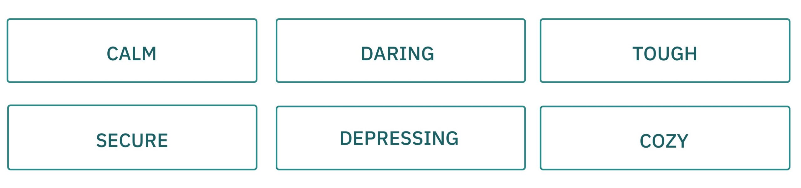
After creating the initial mockups, I presented them to several people to gather feedback. I wanted to understand the mood each layout conveyed to the test subjects. To achieve this, I used the Microsoft Reaction Card Method. In this method, each participant is given a stack of reaction cards and selects the words that best describe the design, then explains their choices. Not all the adjectives matched the characteristics I defined earlier, but the design with the dark background conveyed the desired mood. However, I revised the design because 'tough' or 'depressing' were not the feelings I wanted to create.
Style Tile
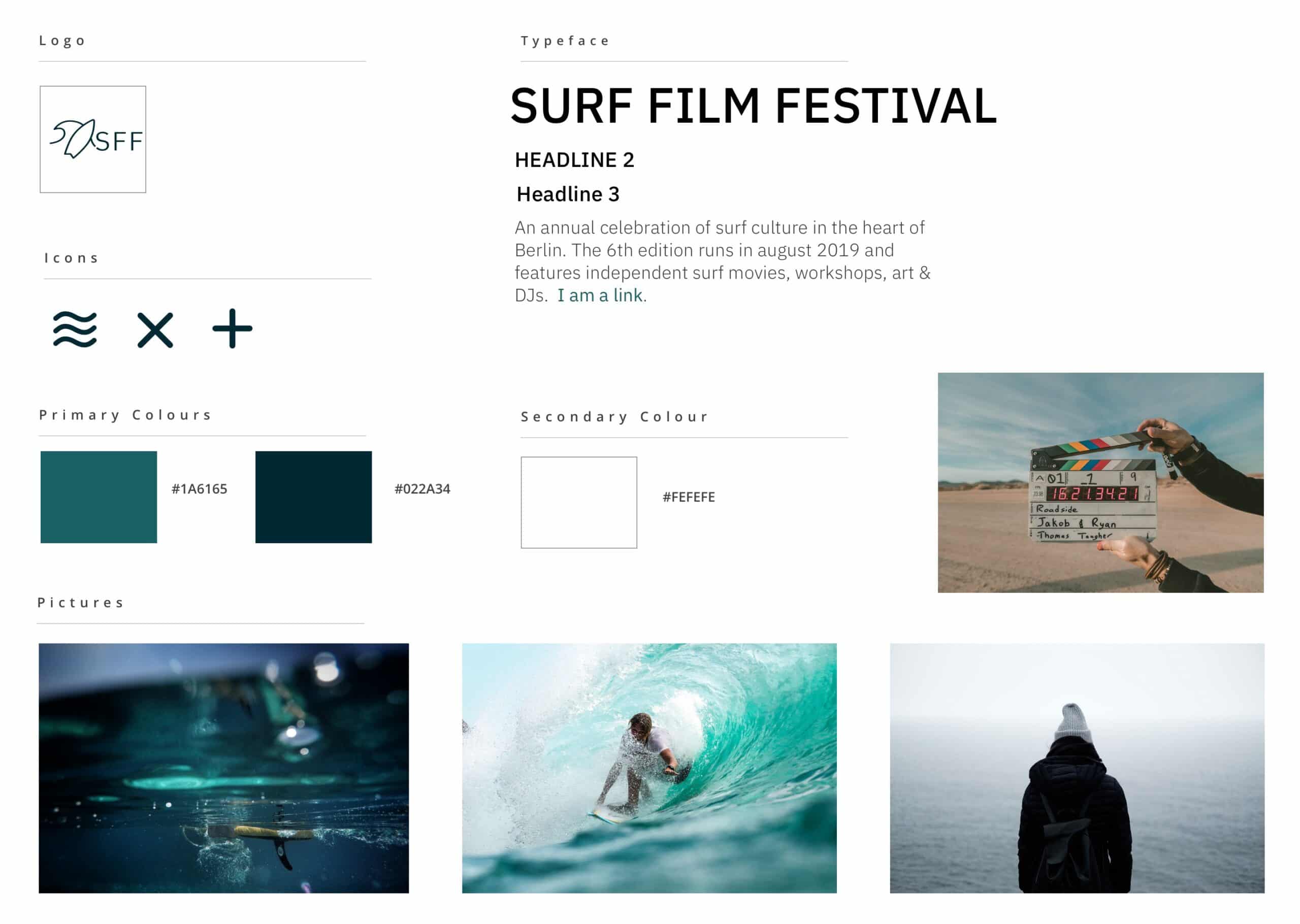
In the Style Tile, I defined the fonts, colors, and interface elements that communicate the essence of the visual brand. I chose three colors and the IBM Plex Sans font, which I believe fits the film festival theme very well.
Prototype
Mockups - desktop view
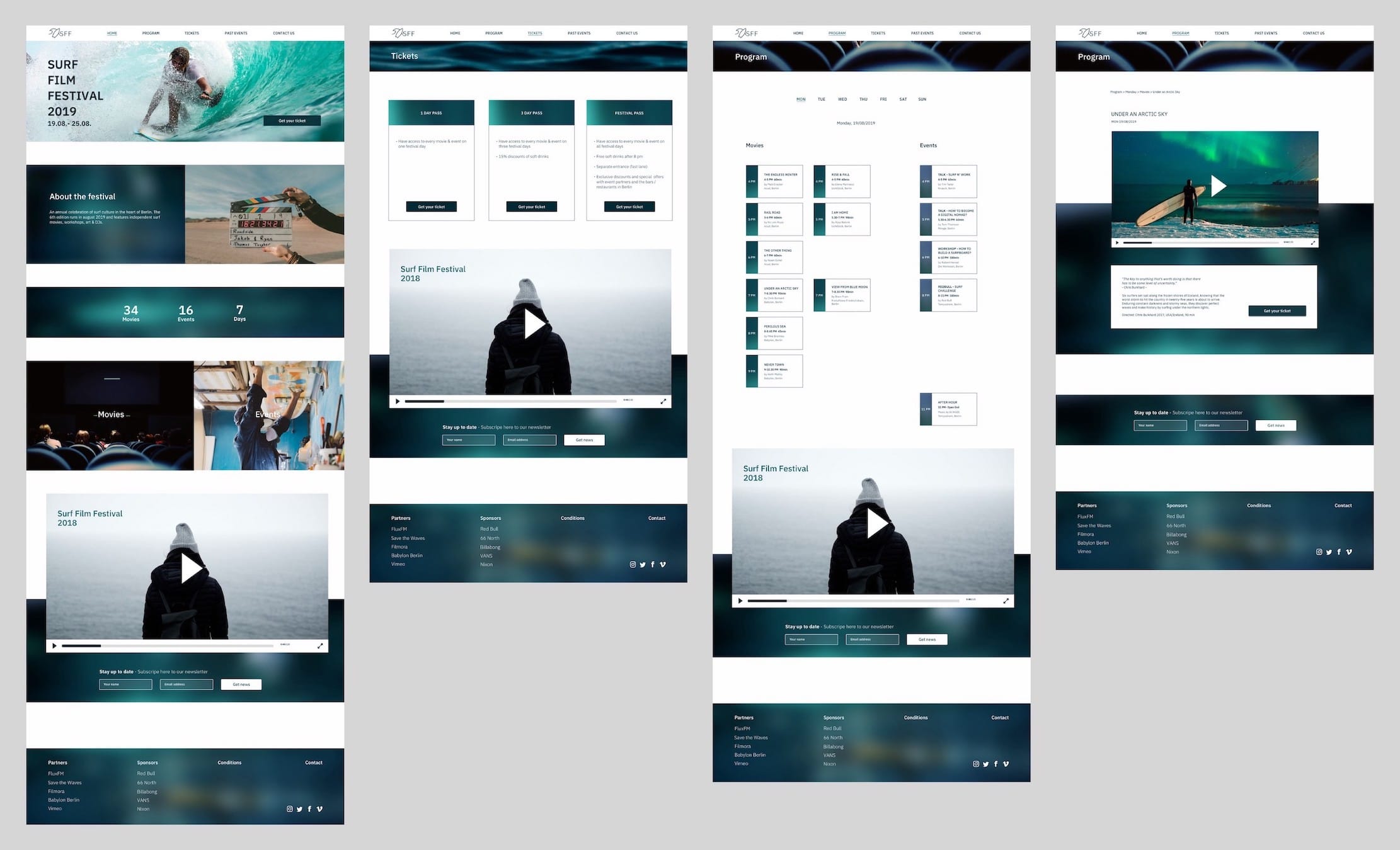
The home page (first screen on the left) highlights what to expect at the festival. The 'films' and 'events' sections lead to the program page, and a video teaser shows impressions from last year's festival.
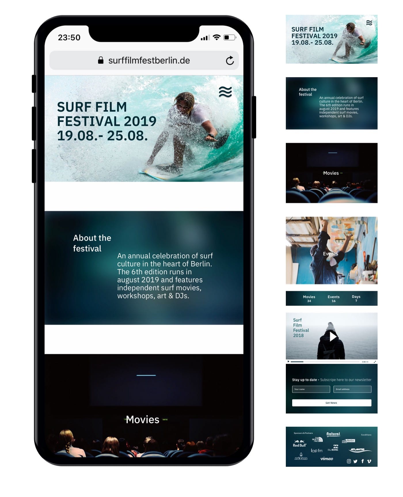
Mockups - mobile view
Testing
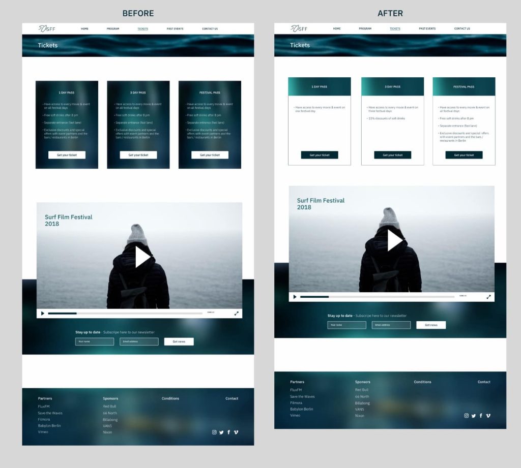
Second Desirability testing
After receiving feedback from the first Desirability test, I redesigned the cards on the ticket page because most testers found them difficult to read. Then, I retested the effectiveness of the screens with other test participants.
Interactive prototype
Conclusion
It was the first responsive website I designed, and it was a challenge to create a UI prototype with high-fidelity screens in just 5 days for different devices, especially since this was a solo project. Contrary to the mobile-first approach, I started designing for the desktop view, which later became a challenge when adapting the site for mobile devices due to the smaller screen space.